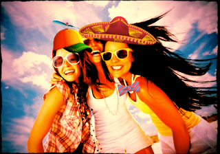
I used splashup to edit this
landscape scene and make a few changes to the lighting. This sight is very
similar to Photoshop and appears to be designed to mirror it as closely as
possible. However, it is more difficult to use and doesn’t include nearly as
many useful tools as Photoshop. Its target audience would be someone looking to
utilize the tools of Photoshop without having to pay for the program. I don’t
think a link should be included because it is basically a worse version of
Photoshop that is harder to use.

I edited this image on
aviary. It offers basic photo editing ability in a format that is very easy to
use. You couldn’t do advanced picture editing on this sight like you could on
Photoshop, but it does have some fun features such as stickers that can be pasted
on top of an image. Its target audience would mostly be kids or people looking
to just make some fun easy alterations to pictures. I think a link should be
included because if you are looking for an easy way to make a few changes to a
picture without all the hassle of advanced Photoshop tools, this is the sight
to use.
I altered this screenshot of
myself on Taaz. To be honest, this site is just plain creepy. It is difficult
and monotonous to use, and the results are scary, even when I used a picture of
a woman and not myself. It has nothing in common with Photoshop; this site
makes edits for you to uploaded pictures of faces. It is more an advertising
site than anything else, showing you what you would look like wearing certain
brands of makeup or wearing the hairstyle of certain celebrities. Its target
audience is probably young women, but it seems like a scam and the results of
the edited pictures creep me out. There should definitely not be a link.
I created this picture of
myself on picmonkey using the same screenshot as on taaz. I like this site
because it is easy to use and has even more effects than aviary. There are
numerous cool filters to put on pictures, and it also does the basic editing
functions such as crop and rotate. It doesn’t have as many advanced features as
Photoshop, but at the same time it is easier to use. It targets the general,
basic level photo-editor. I would recommend uploading a link to this site
because it is different from Photoshop but it offers some cool and easy to use
tools.

 This assignment was to try 2
different Photoshop tutorials from the magazine or website. I looked for the
articles that had the most interesting looking results but weren’t too
difficult and didn’t have too many steps. I settled on a lens flare trick and a
way to create custom linetypes. I decided to use a picture of the beach because
it is a bright, sunny place and worked well for the lens flare. For the custom
linetype I used the paw print, as did the magazine. I didn’t really have control
over principles of design since I was following steps, but the lens flare
project used mostly shadow and color to create this effect. This was a fun but
challenging project, as it required that I try many tools I have never used
before. The lens flare went smoothly, but the line trick was slightly more
challenging. I would look for as detailed instructions as possible in the future,
because these projects require you to do exactly the right thing for a good
result.


