The goal of the word illustration project was to take themes of The Power of One and use them in an image that depicted the tones associated with these words. I mostly took photos of the internet and added filtes, but I added some of my own original components. I used spacing a color to position the words in a way that would accent the images and add to them. I especially liked my last picture with the lion and the mouse. I erased the background behind the mouse and the peanut and scaled them down for this picture. I would spend some more time finding my own original work to add to these pictures if I had more time to do it again.
Joe's Digital Imaging work
Thursday, June 6, 2013
One Word Text Illustration
This assignment was to take some word that we feel best represents The Power of One and make artwork with it that includes themes of the movies. The main character in the movie is in charge of a cactus farm, trains in boxing and attempts to teach English so I made the cacti, books, and gloves the central pieces of my image. I used spacing and perspective to make the gloves seem like they are hanging off of the "E" in persistence. I really like the gradient background I added to this picture. I enjoyed this project because I liked the task of finding one word to summarize the movement that this movie focused on.
Power of One Poster
The movie poster was the task for the Power of One project that I enjoyed most. Our task was to design a realistic-looking movie poster for this movie. I decided to create a cartoon visual that illustrates how one person can make a difference. I then included the real names of the actors at the bottom of the poster t make it seem authentic. I used color as my main element of design to show how from the on person in the center comes many groups of people all united by the same idea. (In this case the idea was civil rights, and the movement in South Africa was related to other civil rights movements around the world.) I really like The Power of One and I put a lot of effort into this poster. This project required lots of creativity and I really enjoyed it.
Wednesday, June 5, 2013
Met review
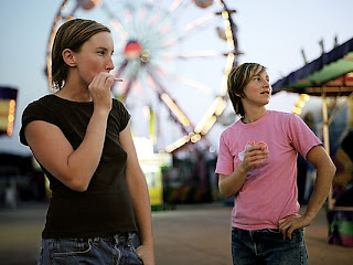
Kelli Connell, 2006
Friday, May 17, 2013
Color Wheel Project
The
color wheel assignment was to take several images of the same theme or from the
same location and put filters onto them to create the colors of the color
wheel. A few months ago I went to the Chihuly Glass Exhibit at the museum in
Richmond. I took several photos of the glasswork, and when I was browsing for
good images to use for the color wheel I realized these would be perfect; many
of the images were already one distinct color and required little help from the
filter. I found the glass exhibit fascinating and I have always thought that
glass blowing is cool, so I was inspired by the images. I using spacing and
size to create balanced, appealing image. I used size especially on the second
image to make all he shoes line up. I chose the sun outline because I thought a
colorful sun would look good, and I chose the show because I was struggling to
think of a second stencil when I looked down and saw my shoe. I am very happy
with the results, and I am especially pleased with the background for my shoe
image.
Friday, April 19, 2013
Original Artwork

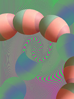
The Original Artwork assignment required that we create two images entirely from our own work; no Google images or other help was permitted. In this project, I used a decorated egg I had made and taken a picture of as the subject of my two images. Behind the egg designs I used two different Photoshop functions to make a cool background. I mostly used color and organization to create the bright, exciting images I was looking to make. I think that both the crossing pattern and circle pattern are centered well and create a psychedelic look in conjunction with the purple and green backgrounds. The most challenging part of this project was probably editing out the background of the egg photo because I didn't take a very good picture of it in my hand. However, the results were rewarding and this ended up being one of my favorite projects.
Friday, March 22, 2013
Alphabet
Subscribe to:
Comments (Atom)


