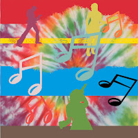
Music Project: The music
assignment involved taking a multiple-layered photo of musical elements with
two backgrounds and transforming it into two different images. I tried to
design two images that would be as aesthetically pleasing as possible; the
second run turned out better because I’d had a practice run already. I was
inspired mostly by the colors of the background, and it was fun to transform
them and layer the images with the notes and musicians. The elements I took
into account in this project were organization, line, color, and perspective. I
used organization and line to space the foreground characters equally from
another to make the image look better. If all the music notes and musicians had
been bunched up the image would not have looked nearly as good. I used color
when deciding how to edit the black music notes and musicians to make them
match the background and each other. I used perspective to layer the image
differently from the way it was layered originally. I am satisfied with my
work; I think both of my images turned out well. I am glad that I got to create
two images and make separate choices for each. I would not do anything
differently, and this was a good learning project.


No comments:
Post a Comment