The goal of the Kaleidoscope Project was to cut out a right triangle from an image and recreate it 7 more times to produce the “kaleidoscope effect.” For both projects I wanted to use an original image that wasn’t too complex, and thus it would appear as one cohesive image in the final creation. I wanted to choose something cool like a car or motorcycle for the first project, which I did, and for the second I chose a picture of a pattern of pebbles that I took in Italy. I used texture in the second project because the pebbles give dimension to the project. I also used perspective in the second project, and the final image looks like a tunnel. In the first project I used color to contrast the white, black, and red of the motorcycle. I loved this project; it was my favorite so far. I found it very easy to come out with satisfying results using almost any image. The only thing I would do differently is making sure the angle is exactly 45 degrees so that there aren’t any diagonal lines on the final images.
Friday, November 30, 2012
Kaleidoscope Project
The goal of the Kaleidoscope Project was to cut out a right triangle from an image and recreate it 7 more times to produce the “kaleidoscope effect.” For both projects I wanted to use an original image that wasn’t too complex, and thus it would appear as one cohesive image in the final creation. I wanted to choose something cool like a car or motorcycle for the first project, which I did, and for the second I chose a picture of a pattern of pebbles that I took in Italy. I used texture in the second project because the pebbles give dimension to the project. I also used perspective in the second project, and the final image looks like a tunnel. In the first project I used color to contrast the white, black, and red of the motorcycle. I loved this project; it was my favorite so far. I found it very easy to come out with satisfying results using almost any image. The only thing I would do differently is making sure the angle is exactly 45 degrees so that there aren’t any diagonal lines on the final images.
Inside-Out Project
In the inside out project,
the assignment was to take an image of the outside of an object such as a
computer and blend parts of this image with parts offering a view to the
inside, such as view of the inside hardwiring of the computer. I decided to do
something with the body, but the face seemed too common of a choice, so I
settled on a hand. I looked through google images until I found pictures of
hand muscles and a hand that matched each other. I used color to blend the
muscles and the skin so that instead of a sharp line appearing, it looks like a
transition from skin to muscle. Doing so also required use of value. I
attempted to use perspective to make the fingers and hand appear on the same
layer. I am satisfied with my work. If I could spend a little more time
blending the fingers and hand it might have turned out slightly better, but
that is my only comment on my work.
Monday, November 19, 2012
New Photo-editing sites
I used splashup to edit this
landscape scene and make a few changes to the lighting. This sight is very
similar to Photoshop and appears to be designed to mirror it as closely as
possible. However, it is more difficult to use and doesn’t include nearly as
many useful tools as Photoshop. Its target audience would be someone looking to
utilize the tools of Photoshop without having to pay for the program. I don’t
think a link should be included because it is basically a worse version of
Photoshop that is harder to use.
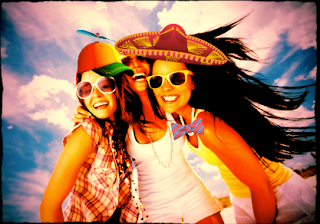
I edited this image on
aviary. It offers basic photo editing ability in a format that is very easy to
use. You couldn’t do advanced picture editing on this sight like you could on
Photoshop, but it does have some fun features such as stickers that can be pasted
on top of an image. Its target audience would mostly be kids or people looking
to just make some fun easy alterations to pictures. I think a link should be
included because if you are looking for an easy way to make a few changes to a
picture without all the hassle of advanced Photoshop tools, this is the sight
to use.
I altered this screenshot of
myself on Taaz. To be honest, this site is just plain creepy. It is difficult
and monotonous to use, and the results are scary, even when I used a picture of
a woman and not myself. It has nothing in common with Photoshop; this site
makes edits for you to uploaded pictures of faces. It is more an advertising
site than anything else, showing you what you would look like wearing certain
brands of makeup or wearing the hairstyle of certain celebrities. Its target
audience is probably young women, but it seems like a scam and the results of
the edited pictures creep me out. There should definitely not be a link.
I created this picture of
myself on picmonkey using the same screenshot as on taaz. I like this site
because it is easy to use and has even more effects than aviary. There are
numerous cool filters to put on pictures, and it also does the basic editing
functions such as crop and rotate. It doesn’t have as many advanced features as
Photoshop, but at the same time it is easier to use. It targets the general,
basic level photo-editor. I would recommend uploading a link to this site
because it is different from Photoshop but it offers some cool and easy to use
tools.
Friday, November 9, 2012
Self-Portrait Project
Self-Portrait Project: This
project required us to transform our self-portrait in a variety of ways and
position all the images next to each other in a grid. I mostly wanted to avoid
repetition in my images, so I tried to make them all look as different as
possible. I left the picture in the center alone so that there is something to
compare the transformed images to. I was inspired by the various tools I found
while playing around on Photoshop. I decided to make the border behind me grass
because I like to be outside, and this was the best way to represent that. I
used color to create similar images on the top and bottom as they were both
darkened, and the images on the left and right were the most modified. On the
corners I used line to change the orientation of the picture to make it look
like the pictures of my head formed a border. I also used texture in the image
on the right. If I had more time I would possibly make a larger grid so that I
could create even more modified images, but I am still satisfied with the
results of this project.
Visual Puns
Visual Puns Project: In this
project. The assignment was to create 4 “visual puns” while using 4 new
Photoshop tools at least in one image. I picked the visual puns that seemed the
most fun to create, and I especially focused on trying to be creative with the
words in each image. The names of the puns inspired me, and once I saw one I
liked it was easy to go with it and create a good image. I used organization/
spacing to place my words in the appropriate place, and perspective to both
place the worm on the book and make the knife appear as though it is coming out
the other side of the cereal box. This was a fun project. And if I had more
time I might spend it developing some of the images further. However, I am
happy with my results.
Subscribe to:
Posts (Atom)